5. I like the model very much ans also it describes the various function
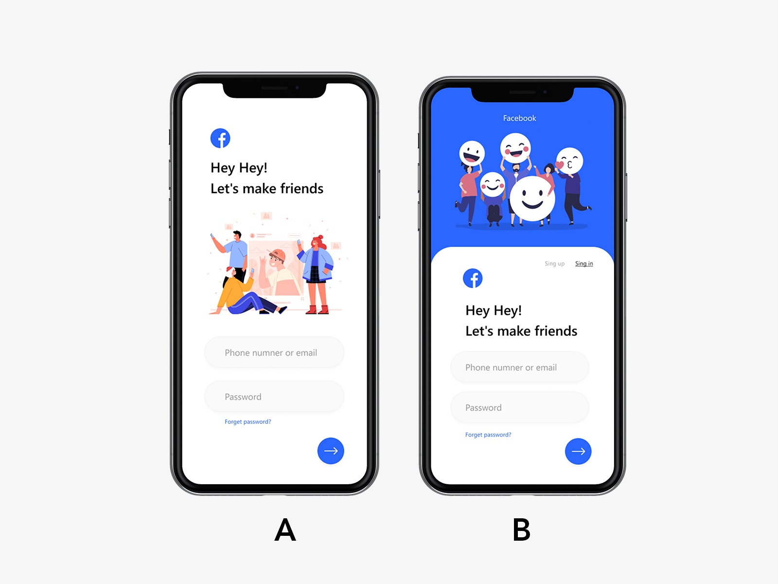
6. I chose option one because the interface is more attractive to me. There was more going on. I am also interested in learning about what the badges refer to. The image on the right seemed to just be about how to register on Facebook.
7. Looks good and i like the design and display screen
9. It looks less complicated
11. Modern, social and bright
12. shadow makes it look more solid
13. good one
14. it's nice quality
17. it's nice
18. Looks less busy to me, prefer more white.
19. it looks nice
20. THAT MOBILE WAS GOOD
21. it's very useful
22. I would prefer the option 1 as it says more about a user profile on twitter.. though this is not a book
23. It is more practical and functional.
27. THAT MOBILE WAS TO GOOD
30. It's got information about a personality. I don't even get the point of the second option.
32. Option 1 has more content available on the screen for me to use.
33. more option in detailed so that choice is very best one
34. screen shot is good
36. It has more activities, and it is more explanatory.
37. It has more information in a single page
38. GOOD
39. so full of activities, it is more explanatory.
42. Option 1 brings everything I need in a full screen unlike the second option
43. looks good and simple to view the same display the multiple applications.
44. This page was very helpful. Because this page already logged in and explain the concept of this app, like make friends.
46. I thought it would be better
47. I WOULD LIKE IT
50. i feel option 1 gives a general overview of the app user interface when actually using the app,it is more real.
17 Responses to Option B
17 people chose B as their choice
4. I like to have a choice
8. GOOD visualization
10. for some reason having two than one makes it more attractive. It seems like I am getting more.
15. this picture is clear
16. Probably More information from the book
24. its more attractive
25. GOOD
26. Because it shows all the features
28. good
29. this options a wider variety and navigation option
31. It is more detailed and informative, more attractive and shows more screens
35. Due to it's choices
40. it was nice
41. It has more information and has steps for what you should do.
45. I choose option 2 because more relevant parameters displayed in the screenshot. So this is helpful.
48. It is more details
49. It asks about you to begin with.
Demographics
Manage pending orders and track invoices.
Gender (Personal)
Age Range (Personal)
Share Your Results
Anyone with the following URL can see these poll results.